
Why most marketing reports fail
Technology has never been so advanced, especially with the rise of AI, which is making new tools easier to build and simpler to use. Yet this progress comes with a trade-off: it's also multiplying the amount of data available and increasing the complexity of turning that data into clear, reliable insights. For this reason, most marketing reporting breaks down long before anyone opens the monthly slide deck.
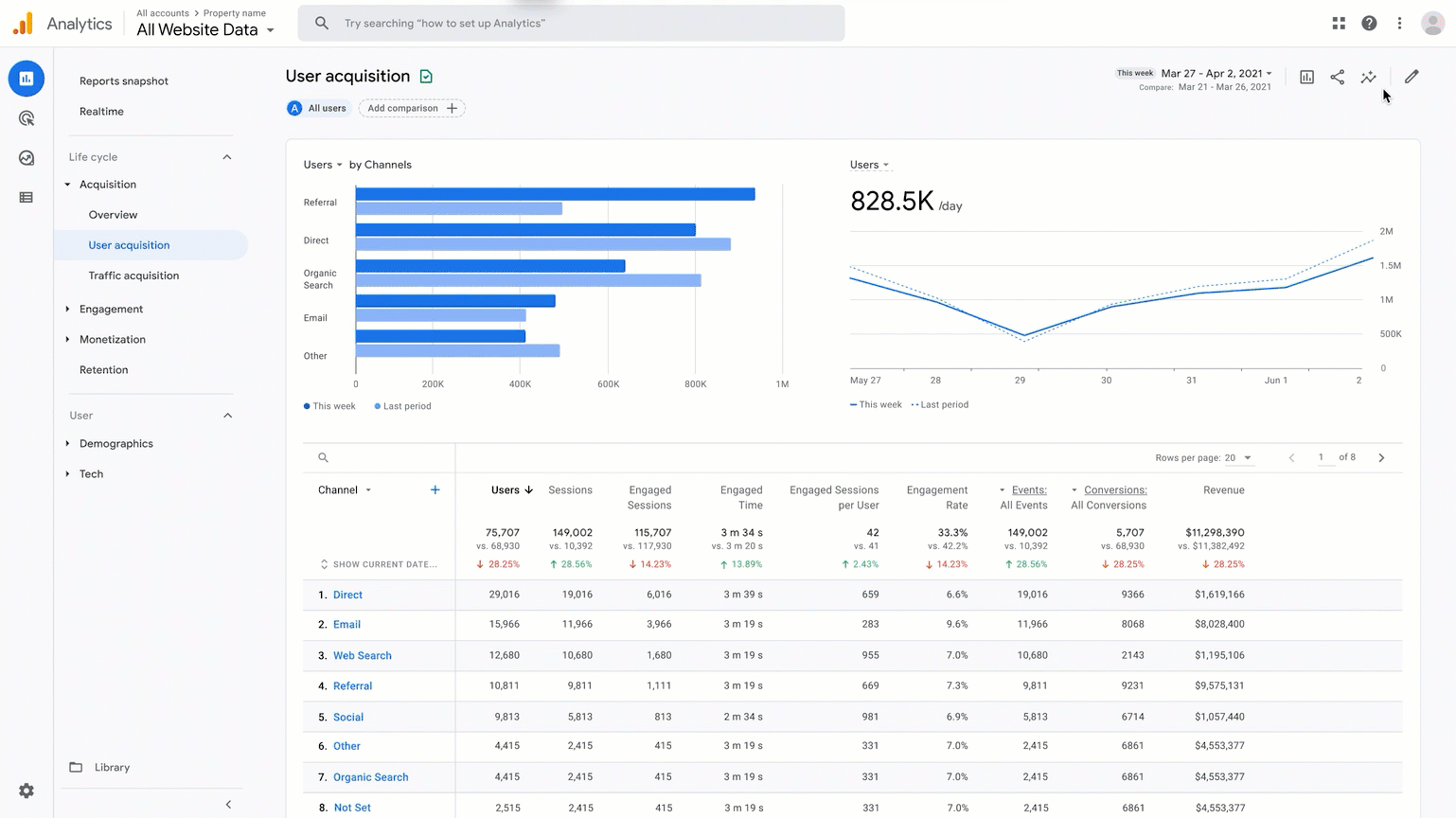
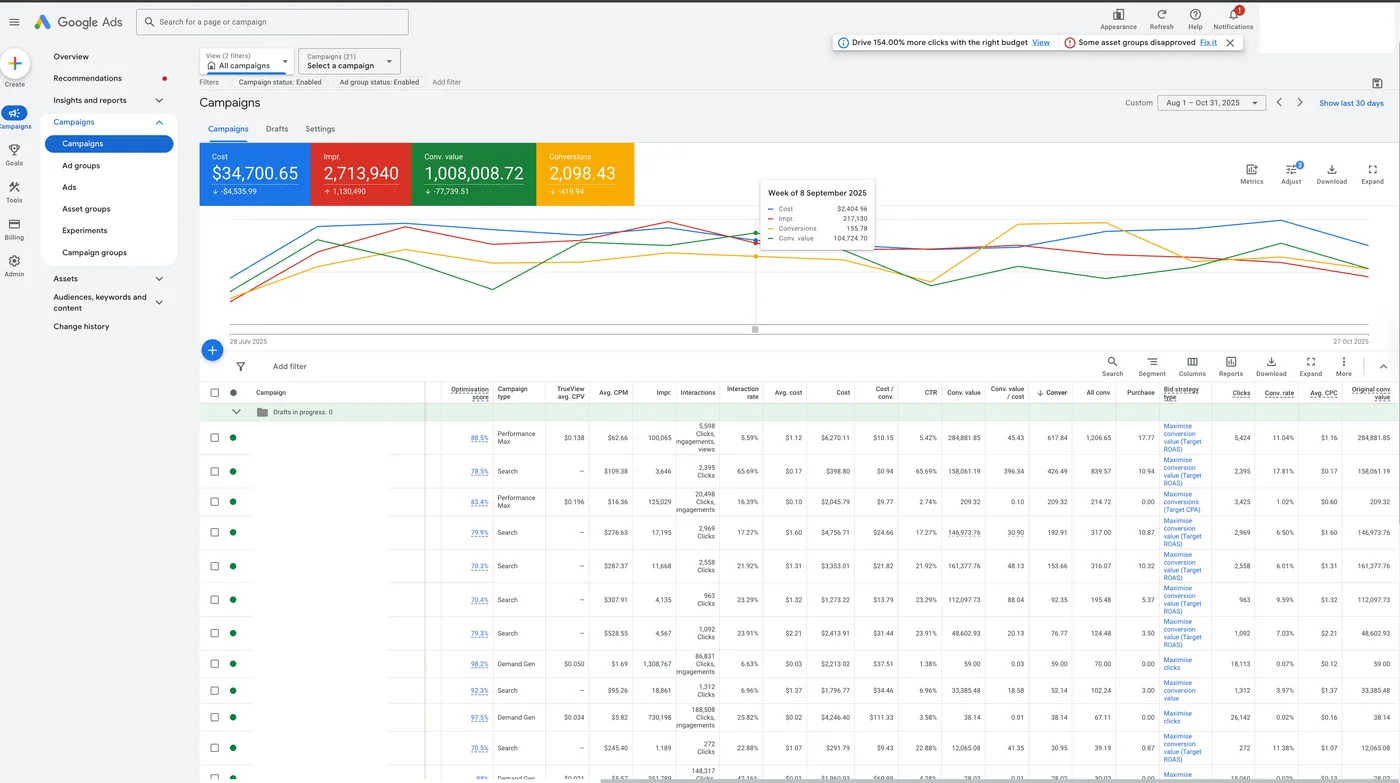
Marketing specialists sit on a goldmine of information spread across dozens of platforms: GA4 for onsite behaviour, Google Ads and Meta for paid performance, SEO tools for organic visibility, email platforms for retention, CRM for lead quality, and e-commerce systems for revenue and product trends. In theory, this should give businesses a complete view of what's driving growth. In practice, it creates missing pieces and blind spots: each tool comes with its own definitions, attribution logic, time delays, and "truth." What counts as a conversion in one platform may not match another; revenue in the e-commerce backend won't always reconcile with ad-reported sales; even basic metrics like sessions or users can vary depending on where you look.
On top of that, the technology constantly evolves, and platforms like Google, Meta and TikTok keep updating their algorithms, campaign types, and reporting rules, which reshape performance signals month to month. And this is exactly where many businesses get stuck. A lot of the clients who come to us aren't looking for "more data" — they already have plenty. They're looking for clarity, confidence in what's true, and a unified view of performance they can actually steer the business from.
Choose the right metrics without losing the big picture
Once the data chaos is acknowledged, the next step isn't to collect more metrics: it's to choose the few that matter most, and organise the rest so they support decisions instead of drowning them.
💡 Tip
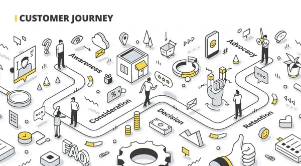
The simplest way to anchor reporting is to tie it to the customer journey. As Dave explains in his article on understanding your customer journey, growth happens through a sequence of moments: awareness, consideration, conversion, experience, repeat. If your reporting doesn't reflect those stages, you end up optimising channels in isolation rather than improving the actual path customers take.
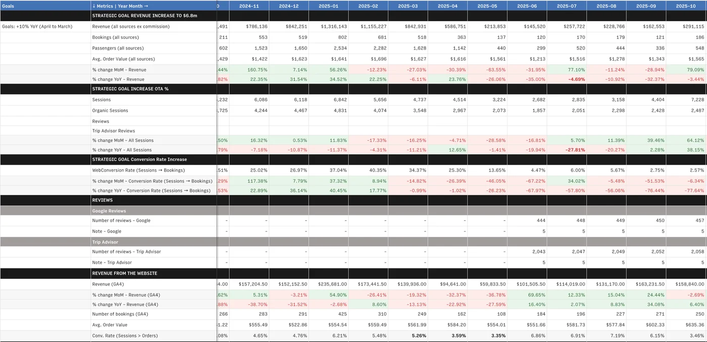
That's exactly the logic behind our Journey Based Metrics (JBM) Monthly Business Dashboard. Its role isn't to show everything that happened last month; it's to create a clear diagnosis of business health through the lens of the journey. We start with the KPIs that represent real commercial outcomes: revenue or purchases/leads, marketing spend, ROAS/CPA, and trend movement over time. These are your journey "scoreboard" metrics: are you attracting enough people, converting them efficiently, and generating sustainable value?
From there, the JBM layers support metrics by stage and channel — traffic quality and source mix for awareness, engagement signals for consideration, conversion rate and AOV for purchase, retention and repeat behaviour for post-purchase. The goal is focus: fewer metrics at the top, deeper diagnostics only where they explain why results moved.
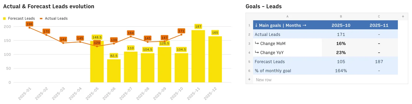
Finally, those KPIs stay static unless they're grounded in goals and forecasts. So each month, the JBM places performance next to targets: are we ahead, behind, or on pace? That immediately turns reporting from a rear-view mirror into a decision tool. When you connect outcomes to journey stages, the "what should we do next?" becomes much clearer, because you're no longer chasing random numbers — you're prioritising actions that strengthen the stage of the journey that will most improve growth.
How to turn the numbers into a story and take action
Having a dashboard full of reliable metrics is only half the job: the other half is interpreting those metrics into a narrative people can trust and act on.
The goal isn't to walk stakeholders through every table or chart; it's to connect signals into meaning without losing sight of the fact that different decision-makers don't look to the same signals. A CEO will care about business outcomes, while a marketing director needs strategic decisions, and a marketing specialist needs channel-level diagnostics. The challenge is shaping one dashboard that speaks to all of them, without getting lost in the weeds.
That starts by reading the top KPIs as the headline of the month: what changed in business outcomes like revenue, spend efficiency, or conversion, and is that movement aligned with goals and forecasts? From there, the supporting metrics become your evidence. Instead of treating channels as separate silos, you use them to explain why the headline moved: how awareness shifted (traffic quality, source mix, reach), whether consideration strengthened or weakened (engagement, intent signals), and what happened at conversion and post-purchase (CVR, AOV, retention).
Seen this way, the dashboard becomes less a "reporting tool" and more a business diagnosis framework: it helps you trace performance up and down the customer journey, spot where momentum is building or leaking, and translate that into a short, prioritised set of actions. That's what makes the story land for every stakeholder — not the volume of data, but the clarity of cause, effect, and next move.
How to turn reporting into an automated decision-making engine
Efficiency is what turns good reporting into a sustainable habit instead of a monthly fire drill. When teams build reports manually, most of the effort goes into repetitive work: exporting from multiple platforms, cleaning spreadsheets, reconciling definitions, and double-checking numbers. That's time not spent on interpretation, and it's also where errors and inconsistencies sneak in.
By automating the data layer of our JBM using a spreadsheet automation tool like Rows, we've been able to remove 80–100% of that manual extraction and consolidation. The impact isn't just speed (though that matters); it's accuracy, because fewer handoffs means fewer mistakes; consistency, because the same definitions and calculations run month after month; and ultimately better insight quality, because analysts can focus on diagnosing what's happening and recommending actions, not copy-pasting data.
Automation also enables industrialisation: the same reporting framework can scale across more channels, more products, or more markets without collapsing under its own weight. In short, automating reporting doesn't make it less human — it makes the human part far more valuable.
Conclusion
The goal of marketing reporting isn't to prove that marketing "did something" last month; it's to make the next decision easier, smarter, and more aligned with business growth. When you simplify the noise into a focused KPI set, map performance to the customer journey, and tell the story behind the shifts, reporting becomes a diagnostic tool instead of a data archive.
If you're reading this and thinking, "we've got the data, but not the clarity," that's a strong signal in itself. Whether you need help tightening your tracking, choosing the right KPIs, or building a reporting framework that actually works for your stakeholders, we're happy to point you in the right direction. Reach out to Data Story for a coffee — even a short conversation can save months of reporting pain.

Written by
Arthur Davey
Performance and Insights Lead· 2 articles
Arthur heads up performance and analytics at Data Story. He specialises in GA4 implementation, custom dashboards, and extracting the insights that drive measurable marketing improvements. Arthur is the team's resident data detective — he finds the signal in the noise.
LinkedInRelated articles
Strategy
Understanding your customer journey
26 March 2025
Purchasing is a decision that happens over time. By breaking that journey into key moments — and measuring them — you give your marketing the focus it needs to actually move the needle.

Analytics
The Complete Guide to Data-Led Marketing in 2025
15 February 2025
Most businesses collect more data than they know what to do with. This guide walks through how to build a marketing function that actually uses it — from analytics foundations to full-funnel attribution.